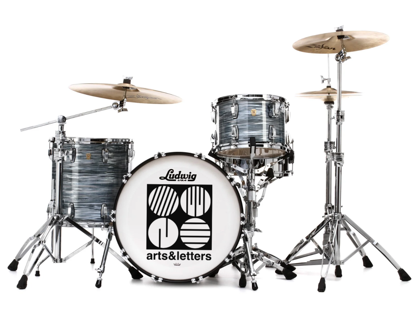
Band brand identity, logo design, and merch design…
arts&letters are an indie pop band from Chicago with a distinct retro sound that blends the eclectic cool of the British Invasion, the scrappy energy of early rock ‘n’ roll, and the timeless style of standards from the Great American Songbook. Their musical mission is to revive and reimagine the songwriting traditions and recording aesthetics of the past to create distinct sonic experiences with heart, humor, hooks, and soul.
Logo Design
The logo is inspired Chicago’s connection to the original Bauhaus movement, specifically the work of painter and photographer László Moholy-Nagy and the architect Ludwig Mies van der Rohe.
László Moholy-Nagy
A 19, 1927
Ludwig Mies van der Rohe
860–880 Lake Shore Drive, 1951
Its structure lies withing the geometry of the Helvetica Bold typeface. The band’s name is the wordmark base of the design. The guides that build the logo’s square symbol and map the spacing between the graphic elements are the width of the letter ‘l’. The tilt of the lines in the upper left circle match the angle of the left side slope of a Helvetica Bold uppercase ‘A’.
TYPOGRAPHY
The main typeface for the band is from the logo’s wordmark - Helvetica Bold Lower Case. This is used for all header information and is specifically reserved for arts&letters and other performers on a bill. The typeface size of each performer/band should be equal.
The ampersand is solely for the band and should be avoided in surrounding text. The complete word “and” with standard word/ letter spacing should be used unless the other parties in the messaging have an ampersand or no-space spelling in their style guides.
The secondary typeface is within the Avenir family - Avenir Medium All Caps for subhead information within layout hierarchy and Avenir Book with standard formatting for body copy and fine print.


